
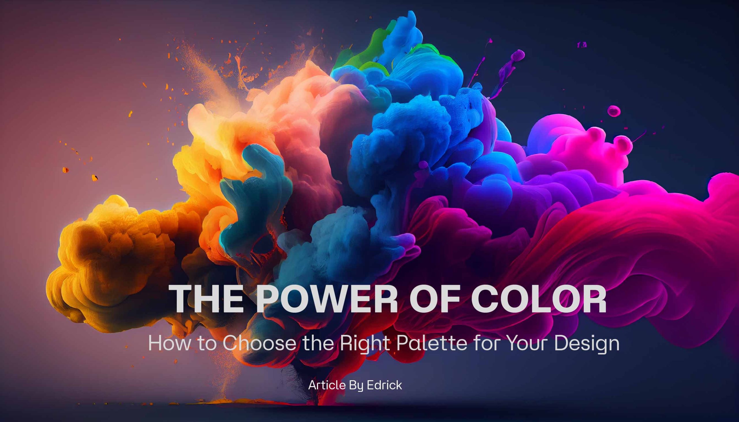
HOME - The Power of Color: How to Choose the Right Palette for Your Design
 The Power of Color: How to Choose the Right Palette for Your Design
Introduction
Let’s talk about color! Ever wonder why certain designs instantly catch your eye or make you feel a certain way? It’s no accident—colors have a way of speaking to us on a deep level. Whether you’re crafting a brand’s identity, designing a website, or just picking out a color scheme for social media, understanding color psychology can make your work more effective (and fun!).
In this post, we’ll dive into how different colors make people feel, some popular color schemes, and a few tips on choosing the perfect palette for your next project.
1. The Basics of Color Psychology
Colors aren’t just pretty—they’re powerful. Blue, for example, tends to make people feel calm and trusting, which is why banks and tech companies often use it. Red, on the other hand, is all about excitement and energy. So if you’re working on something bold or adventurous, red might just be your new best friend.
Want a warm, cozy vibe? Go for yellows and oranges. Need elegance and sophistication? Try shades of black, white, and gray. Think of each color as a different personality in your design toolkit.
2. Popular Color Schemes and How They Work
Now that we’ve got a feel for individual colors, let’s talk about how to mix them. There are a few classic color combos that work well together and are easy to use:
- Monochromatic: Different shades of the same color. It’s clean, sophisticated, and easy to match.
- Complementary: Opposite colors on the color wheel, like blue and orange. This combo gives a lot of contrast and energy!
- Analogous: Colors that sit next to each other, like green and yellow. These feel harmonious and balanced.
Try experimenting with these schemes to see which one speaks to your project’s mood.
3. Color Trends for 2024 and Beyond
Color trends change all the time, and keeping up can add freshness to your designs. Right now, warm neutrals are huge—think earthy tones that feel grounded and cozy. On the other hand, neon accents are also having a moment in digital design, adding a pop of excitement. And pastel gradients? Still going strong!
These trends aren’t just “in” because they look nice; they’re about capturing the feelings people are craving right now—comfort, playfulness, and a bit of optimism.
4. How to Pick the Right Colors for Your Project
Choosing a palette might seem like a small detail, but it can make a big difference. Ask yourself: Who’s my audience? What vibe am I going for? If you’re designing for a wellness brand, calming colors like green and soft blues might be your go-tos. But if you’re working with a fashion or tech brand, vibrant or bold colors could add some wow factor.
Play around with a few options until you find one that feels just right!
5. Color Tools to Make Your Life Easier
There are some fantastic tools out there to help you experiment with colors:
- Adobe Color and Coolors: Great for exploring different color schemes and creating custom palettes.
- Color Hunt: Perfect for finding trending color palettes if you need quick inspiration.
These tools let you see how colors work together in real-time, so you can feel confident in your choices.
Conclusion
Choosing colors is one of the most creative (and fun) parts of design. With a little color psychology in your back pocket, you can make designs that don’t just look good—they feel good too. So go ahead, get a little experimental, and trust your instincts. You might just find the perfect palette that makes your next project truly pop!
0 Comment