HOME - Google Fonts: The Secret Sauce to Clean, Modern Design
 Google Fonts: The Secret Sauce to Clean, Modern Design
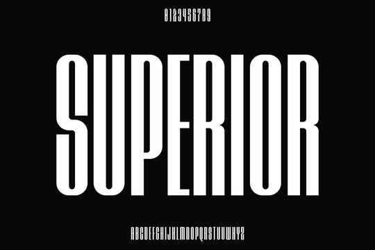
If you’re like most designers, you’ve probably spent countless hours picking just the right font. Sometimes, though, the free options aren’t all that inspiring. Google Fonts, however, has been a game-changer, offering hundreds of high-quality, open-source fonts that won’t break the bank. But where to start?
In this post, let’s zoom in on a specific type of font: the tall fonts. Known for their height and clean lines, tall fonts give text a modern, sophisticated look while helping maximize vertical space. They’re a fantastic choice for headers, posters, or even logos when you need text that stands out without overwhelming.
Why Choose Tall Fonts?
Tall fonts often carry an air of elegance and clarity. They feel airy and give compositions a sense of balance, even when dealing with limited horizontal space. Plus, they’re versatile—they can go from classic and minimalistic to trendy and edgy with the right styling.
Top Tall Fonts on Google Fonts
Here’s a look at a few tall fonts on Google Fonts that make a strong impression:
Roboto Condensed
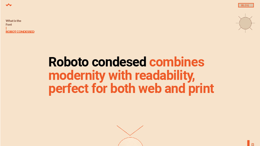
Roboto Condensed is a streamlined version of the much-loved Roboto font, ideal when you want a font that’s both tall and readable. It maintains its structure across sizes and looks professional and modern.
Oswald
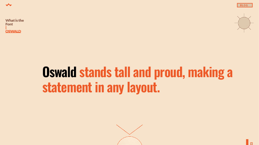
Inspired by classic newspaper styles, Oswald has a tall and condensed look that’s perfect for headers. Its geometric shapes give it a sense of stability, making it great for both web and print.
Archivo Narrow
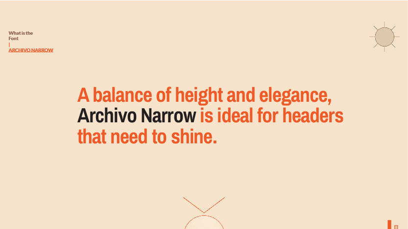
Another excellent choice, Archivo Narrow combines height with just a touch of width, ensuring readability while still giving off a sleek, sophisticated vibe.
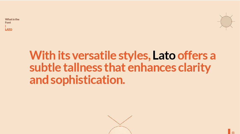
Lato
Though Lato isn’t exclusively tall, its condensed options offer a balance between width and height, making it feel open and highly legible without looking too narrow.
Tips for Using Tall Fonts Effectively
- Pair with Contrasting Fonts: Because tall fonts are bold by nature, pairing them with a softer, rounder font can add visual interest.
- Use Tall Fonts for Impactful Headers: Their height helps them stand out, making them perfect for capturing attention at the top of a page or section.
- Don’t Overcrowd: Tall fonts often need a little breathing room. Give them ample space to keep your design looking clean.

0 Comment